

In the present information age, it is very important to comprehend large sets of data especially because of the wide utilization of complex data.
Can you imagine that 90% of information perceived by the human brain refers to visual information?
This is the area where data visualization becomes critical. Because it turns raw data into easy-to-understand graphical formats such as graphs, charts, and dashboards it facilitates the communication process and as well enables fast and effective presentation of information.
This guide splits into five aims to explain what exactly data visualization is, why it is crucial, how different industries are affected by it, and more. At the end of this folk, you should have adequate knowledge about its advantages, difficulties, and trends.
What Is Data Visualization?
Data visualization is the process of putting data and information in a graphical context. This one includes charts, graphs, maps and other visuals employed to make the arrays of data comprehensible and more importantly to find patterns, trends or relations.
Therefore, the purpose of data and analytics is to provide insights that are easy to understand and can be used to make decisions.
Essential Features of Data Visualization
Data: The data collected from the source prior to analysis.
Visual Representation: Data presented in bar, line, pie and other forms of graphics.
Context: Categories, headings, and captions give information.
Some of the most frequent data visualization forms are discussed in this part, and these include the following.
Bar Charts: Make comparisons of quantities that belong to groups of different categories.
Line Charts: Show trends over time.
Pie Charts: Present parts of a line in a data set.
Heatmaps: Indicate how dense or intense data is within the map.
Scatter Plots: Find a correlation between two variables.
Related Blog: Data Engineering Trends in 2025: Everything You Need to Know
Why is Data Visualization Important?
Data visualization is not geometrical representation of values and fancy charts and graphs. It has a very great and almost crucial role in making data meaningful and effective.
1. Enhances Data Understanding
Visuals help much in reading large volumes of data whereby the entire set of data is comprehended within a glance. For instance, rather than scanning a number table, a beautifully built chart will help one lay focus on the needed aspects.
2. Improves Decision-Making
When data is provided in the form of charts, graphs or any similar representation, then any person making the decision will be able to easily comprehend the most relevant figures of the case, as well as trends associated with that case. This leads to making the right decisions most of the time by relying on the data collected.
3. Identifies Patterns and Trends
Some people use visualizations to discover ‘occult relationships’ between and within sets of data that may not be easily discernible by mere analysis of data.
4. Boosts Communication
Graphs and dashboards are great for telling the story since you create a complete picture of the item you are attempting to relate out of the data. They help organize and break information into forms so that findings can be communicated to a larger population.
Major Advantages of using Data Visualization

1. Facilitates Quick Analysis
Analyzing tools package various data sets into visuals making it easier to assess them in less time.
2. Aids in Predictive Analytics
Data visualization enhances the values of the advanced analytics functions by helping analysts to document time series historical and forecasted values.
3. Increases Data Accessibility
Graphics explain complex information to those who are not involved in development processes, helping technical and non-technical employees to comprehend each other.
4. Enables Real Time Decision Making
These are powerful tools that offer the most current info to guide changes in strategies or operations instantly.
5. Enables Collaboration Across Teams
The visualization shared by organization departments makes them understand that they all see the same data in the same manner.
Use Cases of Data Visualization
Data visualization is widely used across various industries:
1. Business Intelligence
Using Navision tools such as dashboard and report, firms evaluate the sales performance and customer’s behavior in relation to the market.
2. Healthcare
Compliance is maintained through observing data visualization by doctors and researchers to check patient data, prevalence of diseases and outcomes respectively.
3. Finance
Being a critical factor in decision-making, the market needs visual means to evaluate its capabilities and threats, as well as to improve the investment process.
4. Education
Teachers and learners find it easier to understand difficult concepts from learning materials created with interactive learning aids.
5. Government
Nation states employ data visualization to disseminate information concerning census, economic indicators and effects of policies.
The Most Used Tools for Data Visualization

1. Tableau
An efficient software application for building engaging and informative dashboards and complex visualizations.
2. Power BI
Compared to other tools, Microsoft’s tool has strong functions on data integration and visualization.
3. Google Data Studio
An application for creating reports and dashboard single with variety option to customize it.
4. D3.js
A visualization abstraction that allows one to create new and unique views in JavaScript.
5. Python Libraries
When it comes to coding data visualizations, libraries such as Matplotlib or Seaborn are perfect for it.
6. Excel
Although, it still dominates the basic data visualization tools and provides satisfactory results.
How to Design Good Data Graphic?
Designing convincing visualizations entails a lot of planning and implementation. Here are some best practices:
1. Choose the Right Type of Chart
Every type of chart has its own use. For instance, comparisons are best represented using bar charts and trends using line charts.
2. Focus on Simplicity
Avoid clutter. The concepts never need to outweigh the data because the purpose of this method is not to confuse the reader.
3. Use Colors Wisely
Words in different colors can draw attention to ideas but if used too often, it can just blur the reader’s vision. Adhering to a regular color scheme.
4. Maintain Accuracy
When the scale of representation is false or distorted then the area’s size will also be misinformed.
5. Make it Interactive
Further, by way of flexibility, it also enables users to ‘play’ with the data through what is commonly known as the interactive dashboard.
Challenges in Data Visualization
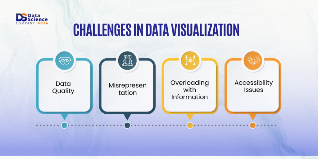
1. Data Quality
They said that they sometimes end up with poor quality data that results in poor visualizations. There is always a need to clean and validate data.
2. Misrepresentation
A misconception arises from visuals if not properly crafted. The top rule of content creation should always stick to the principle of accuracy and show it to the audience.
3. Overloading with Information
It is always very wrong to put so much information in one image since people will be confused to try and comprehend all of it. Sit on the Key Facts Only.
4. Accessibility Issues
Making use of visuals should be helpful to impaired vision people using the recommended colors and fonts.
Trends of data visualization in the future
1. AI-Driven Visualization Tools
AI is emerging as being useful in producing and personalizing visualizations.
2. Immersive Visualizations
With the use of AR and VR, it is now possible to experience the data differently than what is employed in existing approaches.
3. Real-Time Analytics Implementation
Digital consumers’ need for real-time analysis is fueling steady advances in dynamic data visuals.
4. Enhanced Personalization
Pre-configured homepage widgets that are configurable according to personal use are now common.
Concluding Thoughts
Data visualization is a useful tool that connects data on one side and insights on the other. The latter makes data easier to understand and implement so that it can be used to come up with decisions, understand the general trends, as well as to convey information.
Essential for business entrepreneurs, educators, and researchers alike in today’s ‘big data’ environment, data visualization skills cannot be underestimated.
FAQs
1. What are the basic principles of data visualization?
Four fundamental concepts include clarity, simplicity, accuracy, and relevance. Make your charts and graphs clear and simple and focus on delivering the major conclusions.
2. How do you choose the right tool for data visualization?
Some of the factors that one may need to consider are the complexity level of data, features being required, and the cost implication. Advanced requirements are fulfilled via Tableau and Power BI, while Excel is best for general use.
3. Can data visualization be used for personal projects?
Simple tracking of finances or analysis of fitness data and other self-driven projects could benefit greatly from the use of visual tools.